The 10 Worst Jerseys in NHL History
“You’re gonna like the way you look. I guarantee it!” - Former Men’s Warehouse CEO George Zimmer
Too bad Zimmer and Men’s Warehouse don’t design hockey jerseys or hockey SWEATERS if you follow Canadian terminology. Don’t get me wrong. The main home and away jerseys of most NHL teams look great, especially those of The Original Six. Those teams especially have iconic looks that have been around for generations. Even newer teams like the Minnesota Wild and the Las Vegas Golden Knights have done a good job producing a bad-ass hockey jersey. Where it gets dicey is when you add in a third alternate jersey. Let me tell you, they’re not all winners, far from it in some cases.
The NHL and Adidas recently released their new Reverse Retro jerseys for the 2022-23 NHL season. This is the second partnership between the parties to release a Reverse Retro Jersey. The first was two years ago. I think they did a great job on all of them…except the Mighty Ducks one. This year’s edition of the Reverse Retro jerseys are not as good, in my opinion. I like this year’s version of the Rangers, Wild, Jets, and Flyers Reverse Retro jerseys.
This is NOT good. (Photo Credit: twitter.com)
Others…not so much. The interlocking hockey stick and palm tree logo on the Florida Panthers' new alternate jersey looks like it should be worn by Jackie Moon in Semi-Pro. The front of the St. Louis Blues third jersey looks like an ad for a Blues night that one would find above a urinal in the men’s room of a local dive bar. However, the Retro Reverse jerseys of two teams, in particular, stood out to me as being really bad. Here I thought both Adidas and the NHL wanted to make money selling jerseys. What’s even worse is that the NHL and Adidas missed a golden opportunity to create some great jerseys for the Original Six team. I’m referring to those new jerseys of the Chicago Blackhawks and the Detroit Red Wings.
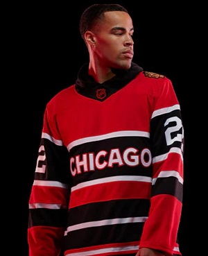
This isn't much better. (Photo Credit: WGN-TV Twitter)
If the word “plain” was an NHL Adidas Reverse Retro Jersey, it would either be a Blackhawks or Red Wings jersey. I get that these may have been the jerseys that these teams wore back in the day. Why remind fans of those mistakes? Let’s take Detroit’s new threads. It’s just a red sweater which a couple of black stripes (which they never do) with “DETROIT” in plain font across the front. It looks like a discount store jersey made for sale to avoid getting hit with an NHL licensing lawsuit. The new alternate jersey of the Blackhawks isn’t much better. In fact, I think it’s worse. It’s as if the Blackhawks tried to copy the Red Wings’ homework and change one or two words to avoid getting docked for plagiarism. I wonder if Jonathan Toews and Patrick Kane made trade requests after learning they would need to don these threads.
That got me thinking. Which are some of the worst jerseys in NHL history? There have been some rough-looking ones over the years. Many third jerseys of NHL teams during the early-to-mid 2000s were questionable. Look up those of the Dallas Stars, Phoenix Coyotes, Atlanta Thrashers, Edmonton Oilers (OMG, what is that on the front???), and Calgary Flames (is that a dragon??).
I decided to do a little research and come up with 10 of what I believe are the worst jerseys in NHL history. Here they are:

Flames legend Jarome Iginla and "Blasty" (Photo Credit: Flames Facebook Page)
#10: “Blasty” Calgary Flames Alternate Jersey (1998-06)
This uniform isn’t actually THAT bad. At first, I wasn’t sure if that was a dragon or a horse on the front. In 1998, the Calgary Flames decided to celebrate “The Year of the Cowboy” with this jersey. So, it IS a horse! What kind of horse breathes fire? What does a horse have to do with a flame? Do they even have cowboys in Calgary, Alberta? I just don’t get it.
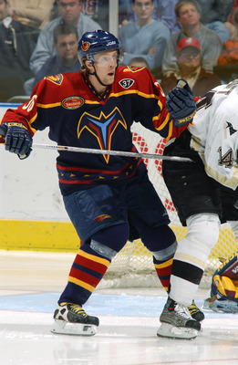
This screams minor leagues (Photo Credit: Scott Cunningham/Getty Images)
#9: Atlanta Thrashers Alternate Jersey (2003-2006)
The Atlanta Thrashers played NHL hockey in Atlanta from 1999-2011. While playing in what is now known as State Farm Arena, they wore this as their alternate jersey. This looks like something a minor-league hockey team would wear. I had to Google what the “T” looking thing is. Apparently, it’s a thunderbird. The fact that I had to do a Google search to find the meaning of this jersey earned it a spot on my list.
SENS? That's it??? (Photo Credit: twitter.com)
#8: Ottawa Senators Alternate Jersey (2009-11)
“SENS?” That’s all you got? Really? Boring. Next!!!

You can't unsee this (Photo Credit: Drive4Five Blog)
#7: New York Islanders (1995-97)
Oy! It’s the Gordon’s Fisherman! He’s right there on the front of this Islanders jersey! Now I understand why New York Rangers fans used to call Islanders fans fish sticks. It all makes sense now! This is a perfect example of what happens when you mess with a good thing. Luckily, the Islanders eventually reverted back to their traditional uniforms.
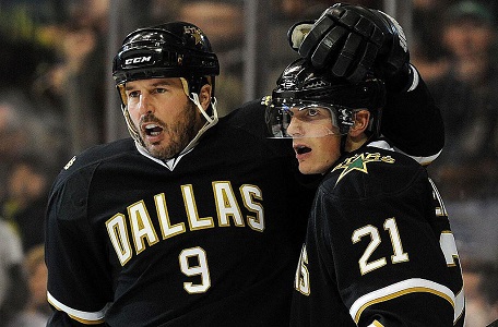
Mike Modano is celebrating a goal, not these jerseys (Photo Credit: 106.3 The Buzz)
#6: (tie) 2011-14 New York Islanders thirds/2008-2013 Dallas Stars
I guess the Islanders didn’t learn much after all. Are these supposed to be basketball jerseys or hockey jerseys? These jerseys look like a half-assed homework assignment you turn in at the last second in hopes of getting partial credit. Numbers on the front of a hockey jersey just don’t look right to me. Maybe the Gordon’s Fisherman Islanders jerseys weren’t so bad after all. What fictional character would the equivalent Dallas Stars jersey feature? My vote would have been Chuck Norris as Walker, Texas Ranger. Tell me that jersey wouldn’t sell.

The "Meth Cat" uniforms. (Photo Credit: Bruce Bennett Studios via Getty Images)
#5: “Meth Cat” Nashville Predators Third Jersey (2001-2007)
Hello vomit! That’s my initial reaction when looking at these jerseys. The 3D-ish version of the Predators logo is solid but why this color? It looks like burnt mustard meets bile meets vomit. Some fans even nicknamed these threads the “Meth Cat” jerseys. That can’t be good. Apparently, the Predators won about two-thirds of the games where they wore these jerseys. If their goal was to thoroughly confuse their opponents, it worked!
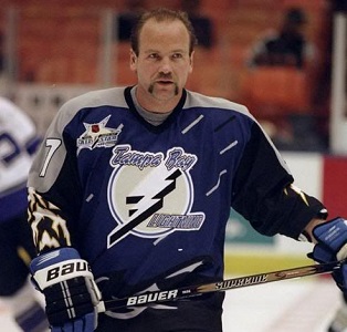
Weather…on a hockey jersey! (Photo Credit: jonathanberthold.com)
#4: 1996-99 Tampa Bay Lighting Alternate Jersey
The Tampa Bay Lightning jerseys and as a franchise have both come a long way since the mid-to-late 90s. Before that time, they had minor league-ish-looking jerseys like this classic. There’s a lot going on with this uniform. The small diagonal lines are meant to be rain. That makes sense if you’re going to be called the Lightning. What about those sleeves? Apparently, those are supposed to be clouds producing lightning. They kinda look more like zubaz pants to me, but hey, to each their own!
Wayne Gretzky, Burger King Employee #99 (Photo Credit: flickr.com)
#3: 1995-96 Los Angeles Kings Alternate Jersey
What in the actual hell is this? Wayne Gretzky looks ridiculous in this jersey. How could they do this to “The Great One?” Better yet, why does it look like the “Burger King” is on the Kings’ jersey? There is nothing good about this jersey except the player in this picture who wore it. The font is weird. The Burger King logo is even weirder. How is this one only number three???
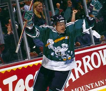
There's a cartoon on his jersey! (Photo Credit: reddit.com)
#2: 1995-96 Mighty Ducks of Anaheim
The Hockey Gods are still probably reeling from this creation. This jersey is just plain creepy. Why on earth would you have a half-man, half-duck exploding from the ice as your ENTIRE FRONT of your team’s jersey? This would be cool if it were a t-shirt being sold in the team store or as part of a cartoon. Grown men should not be wearing this, but yet they did! I thought the original Mighty Ducks jerseys from the Paul Kariya days were pretty cool. This is legendarily bad, but still not the worst-ever NHL jerseys.
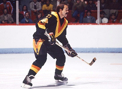
So many V's (Photo Credit: flickr.com)
#1: Vancouver Canucks (1978-84)
Wow. This ACTUALLY happened. The Vancouver Canucks jerseys from 1978-84 are not only the worst jerseys in NHL history. They may be the worst jerseys in the history of professional sports! There are so many V’s – even on the socks! It was said that this jersey was supposed to pay homage to Vancouver’s original hockey team – the Vancouver Millionaire. These Canucks certainly didn’t dress like millionaires! Their logo was featured on these jerseys but as tiny shoulder patches. If the Vancouver Canucks were trying to win an ugly sweater contest, they certainly succeeded. Luckily for Canucks fans, the team ditched the “V” jerseys in 1985.
